Reciprobit plots
Here, we will examine the functionality in pylater for creating figures in ‘reciprobit space’.
First, we will import the necessary packages:
import pylater
import pylater.data
Reciprobit plot space
Reciprobit plots are initialised by creating an instance of pylater.ReciprobitPlot:
plot = pylater.ReciprobitPlot()
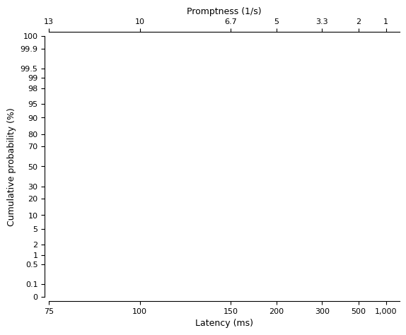
As shown above, this style of plot has several noteable features:
The vertical axis shows probability as a percentage but with a non-linear scale. Between 0.1% and 99.9% (by default), the probability is on a probit scale. Outside of these bounds, the probability is on a linear scale (since the probit transform becomes undefined at 0 and 1).
The lower horizontal axis shows the reaction time (‘latency’), again with a non-linear scale. Here, the time is shown with a negative reciprocal scale.
The upper horizontal axis shows the reciprocal of reaction time (‘promptness’).
Note: If provided without any arguments, it creates a new figure - you can also use the fig_ax parameter to use an already-created figure.
Plotting observations
To show how reaction time data looks in a reciprobit plot, we can load some example data:
dataset = pylater.data.cw1995["b_p50"]
We then use the plot_data method of our reciprobit plot variable to add the data to the plot:
plot = pylater.ReciprobitPlot()
plot.plot_data(data=dataset);
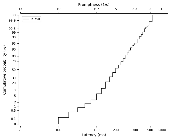
This shows an empirical cumulative distribution function (ECDF) representation of the observed data using a step plot.
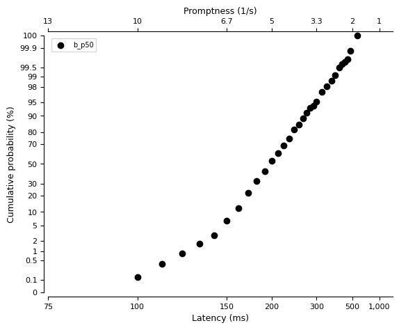
We can also show the ECDF using a scatter plot:
plot = pylater.ReciprobitPlot()
plot.plot_data(data=dataset, plot_type="scatter");
Customising the plot
The overall figure and axis properties can be manually adjusted by access the fig and ax attributes of the ReciprobitPlot instance.
Additionally, customisations can be applied by providing additional keyword arguments to plot_data; these are passed directly to the underlying Matplotlib plotting function.
For example, to change the colour of the data plot and give it a different name:
plot = pylater.ReciprobitPlot()
plot.plot_data(data=dataset, label="Participant B, 50%", c="blue");

Last updated: Wed May 15 2024

Python implementation: CPython
Python version       : 3.10.14
IPython version      : 8.24.0

matplotlib: 3.8.4

pylater: 0.1