Lifelines of the Encyclopedia of Melbourne
The Encyclopedia of Melbourne is an online encyclopedia made up of 1,613 entries detailing the history of Melbourne on different themes, as well as summaries of 1,241 key figures and links to their entries in the Australian Dictionary of Biography. This data is also saved as an RO-Crate.
This tutorial will extend that of Exploring temporal dimensions of RO-Crates to build a comparative timeline of the people included in the Encyclopedia of Melbourne, and explore what analysis we can take from it.
What you'll learn
- Getting an overview of a large crate with
summary()andglimpse(). - Reading and formatting dates across several entity types with
convert_dates(). - Separating the people who are subjects of entries from the authors who wrote them, using
annotate_entities()andwhere(). - Following relationships to add each person's birthplace.
- Building a comparative timeline of people's lives with Plotly, and reading patterns from it.
Running this tutorial
Install crategraph with Jupyter and the plotting dependencies, then launch a notebook:
1. Load the crate and get an overview
=== Graph Summary ===
Source: data/ohrm/EMEL-ro-crate
Entities: 12748 | Relationships: 26840

Entity types:
  Person                                             1706  ▒▒▒▒▒▒▒▒▒▒▒▒▒▒▒
  Entry                                              1613  ▒▒▒▒▒▒▒▒▒▒▒▒▒▒
  File, DigitalObject, thumbnail                     1559  ▒▒▒▒▒▒▒▒▒▒▒▒▒▒
  Place                                              1452  ▒▒▒▒▒▒▒▒▒▒▒▒▒
  RepositoryObject, DigitalObject, digitised record  1370  ▒▒▒▒▒▒▒▒▒▒▒▒
  PublishedResource, ResourceSection                 1299  ▒▒▒▒▒▒▒▒▒▒▒
  ...
  Theme                                                21

Relationship types:
  hasFile                 3122  ▒▒▒▒▒▒▒▒▒▒▒▒▒▒▒
  dobject                 3119  ▒▒▒▒▒▒▒▒▒▒▒▒▒▒▒
  preparedBy              2906  ▒▒▒▒▒▒▒▒▒▒▒▒▒▒
  Entry                   2441  ▒▒▒▒▒▒▒▒▒▒▒▒
  Primary                 2261  ▒▒▒▒▒▒▒▒▒▒▒
  Related                 2114  ▒▒▒▒▒▒▒▒▒▒
  Relationship            2073  ▒▒▒▒▒▒▒▒▒▒
  Theme                   1757  ▒▒▒▒▒▒▒▒
  linkedArchivalResource  1477  ▒▒▒▒▒▒▒
  birthPlace              1180  ▒▒▒▒▒▒
  deathPlace              1100  ▒▒▒▒▒
  deathState              1081  ▒▒▒▒▒
  birthState              1038  ▒▒▒▒▒
  place                    867  ▒▒▒▒
  alsoKnownAs              304  ▒

Most connected: Victoria (1011), VPRS 3183 City of Melbourne Town Clerk's Correspondence Files II (835), The Everyday War: World War I and the City of Melbourne (701), Melbourne (699), Nicole Davis (688)
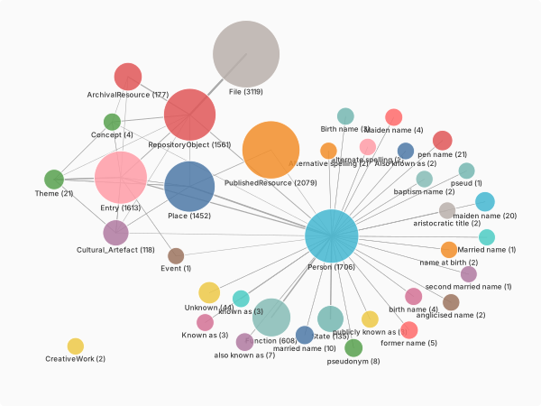
Reviewing the summary and the glimpse, we can see that they largely fall into
- Persons, with many smaller associated alternative name options
- Places
- Entries
- Repository objects and their connected files, connecting to all three.
2. Formatting Dates
In Exploring temporal dimensions of RO-Crates we learnt how to use crategraph to read, format, and save the dates that are included in different entities, and created a timeline across different entity types. We will use that code to see how dates are used in this dataset:
import pandas as pd
import plotly.express as px

types = ["Person", "Entry", "Event", "Place", "Theme", "RepositoryObject"]
dated = crate.select(entity_types=types).convert_dates(report=True)

comparison_df = pd.DataFrame(
    dated.entity_records(
        columns=["label", "type", "start_date", "end_date", "date_precision", "year"]
    )
)

fig = px.scatter(
    comparison_df,
    x="start_date",
    y="type",
    color="type",
    hover_name="label",
    hover_data={"year": True, "date_precision": True, "type": False, "start_date": False},
    category_orders={"type": types},
    title="Encyclopedia of Melbourne records through time, by type",
)
fig.update_traces(marker=dict(size=11, opacity=0.6))
fig.update_layout(yaxis_title=None, xaxis_title="Year", legend_title=None, height=400)
fig.show()
convert_dates: parsed 2669/2673 entities with date fields (100%).
  4 unparseable — e.g.:
    #D00000390   startDate='27 Aug c. 1900'
    #D00000237   startDate='undated'
    #D00000181   startDate='undated'
    #D00000227   startDate='undated'
Here we can see we have meaningful dates for many Person and Repository Object entities, but only one for an Entry and none for Events and Places. We can also check the precision on our dates:
And see that in almost every case, we have dates precise to the day.
3. Tidying the Persons data
Let's delve into the people included in the Encyclopedia of Melbourne. There are 1,706 Person
entities, but they are not all the same kind of person: some are the subjects of entries, and
some are the authors who wrote them. The subjects carry an identifier and birth and death
dates; the authors carry only a name.
Rather than build a DataFrame of all of them and split it apart afterwards, we can mark the
difference on the graph itself and filter on it. annotate_entities adds a field computed for each
person, and where keeps the ones we want. While we're here, we convert the dates and give the
start and end dates names that mean something for a person (birth and death):
people = (
    crate.select(entity_types=["Person"])
    .convert_dates(report=False)
    .annotate_entities(
        is_author=lambda e: e.get("identifier") is None,
        birth_date=lambda e: e.start_date,
        death_date=lambda e: e.end_date,
    )
)

subjects = people.where(is_author=False)
authors = people.where(is_author=True)

print(f"{len(subjects.entities)} subjects and {len(authors.entities)} authors")
That leaves 1,241 subjects, which matches the Encyclopedia's own count of key figures, and 465
authors. Now we can build a DataFrame of just the subjects. entity_records takes the columns we
want, so we ask for only the ones that are useful here rather than loading every property and
tidying up afterwards:
columns = [
    "name", "alsoKnownAs", "birth_date", "death_date",
    "date_precision", "gender", "function", "summaryNote", "year",
]
df = pd.DataFrame(subjects.entity_records(columns=columns))
We can then check and confirm we have a birth and death date for all our remaining people:
print(
    f"There are {df['birth_date'].isna().sum()} people with no birth date recorded "
    f"and {df['death_date'].isna().sum()} people with no death date recorded."
)
4. Visualising Lifetimes
Plotly has a timeline function, that uses a gantt chart to create a timeline where we can record people's lives from birth to death. We first sort the people by birth then death date, so the lifelines come out in order: Plotly draws one bar per row in the order the rows appear. Then we give it the basic information that we need:
- our data source:
df, sorted x_start: when the person's lifeline beginsx_end: when the person's lifeline endstitle: describing what we are looking at
Each lifeline's vertical position is simply its place in that birth order, so we hide the y-axis labels, which would otherwise just be running numbers.
df = df.sort_values(by=["birth_date", "death_date"]).reset_index(drop=True)

fig = px.timeline(
    df,
    x_start="birth_date",
    x_end="death_date",
    title="Lifetimes of People Included in the Encyclopedia of Melbourne",
    hover_data={"name": True, "birth_date": True, "death_date": True},
)
fig.update_yaxes(showticklabels=False, title=None)
fig.show()
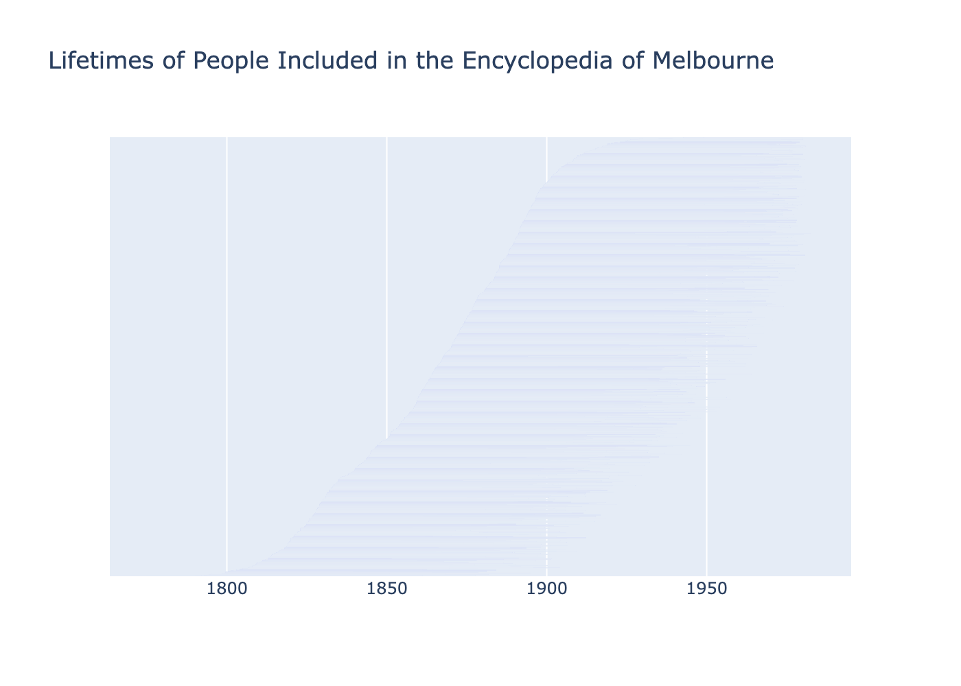
This is a little hard to read at the default height! Let's give the plot more room by setting a
height. The lifelines also look faint, because Plotly leaves a gap between bars and with one bar
per person that gap is most of the space; bargap=0 lets each bar fill its lane. (You can also use
the controls at the top of the Plotly figure to zoom in and around.)
fig = px.timeline(
    df,
    x_start="birth_date",
    x_end="death_date",
    title="Lifetimes of People Included in the Encyclopedia of Melbourne",
    hover_data={"name": True, "birth_date": True, "death_date": True},
    height=1000,
)
fig.update_yaxes(showticklabels=False, title=None)
fig.update_layout(bargap=0)
fig.show()
This chart shows a focus on the eighteenth and nineteenth century - it's only as we get to the top 10% that we see birthdates in the twentieth century. We can confirm this with our data source:
# Define century boundaries
bins = [
    pd.Timestamp("1700-01-01"),
    pd.Timestamp("1800-01-01"),
    pd.Timestamp("1900-01-01"),
    pd.Timestamp("2000-01-01"),
]
labels = ["18th century", "19th century", "20th century"]

df["century"] = pd.cut(df["birth_date"], bins=bins, labels=labels, right=False)

for label in labels:
    print(f"There are {df.loc[df['century'] == label].shape[0]} people born in the {label}")
There are 13 people born in the 18th century
There are 1100 people born in the 19th century
There are 128 people born in the 20th century
And by plotting a histogram:
We can also make the chart more interesting by using other data in our dataset, such as colour
coding by gender, by passing color:
fig = px.timeline(
    df,
    x_start="birth_date",
    x_end="death_date",
    title="Lifetimes of People Included in the Encyclopedia of Melbourne, coded by gender",
    hover_data={"name": True, "birth_date": True, "death_date": True},
    height=1000,
    color="gender",
)
fig.update_yaxes(showticklabels=False, title=None)
fig.update_layout(bargap=0)
fig.show()
This shows a stark difference in the number of women vs men included in the Encyclopedia! We don't
need a DataFrame for the exact numbers; entity_counts tallies a field straight off the graph:
Colouring by gender made Plotly draw the men and women as two separate blocks, one above the other,
because it groups the bars by colour. To weave them back into a single birth-ordered timeline, we
give each person an explicit position from the sorted index and pass it as the y value:
df = df.reset_index().rename(columns={"index": "y-axis_order"})

fig = px.timeline(
    df,
    x_start="birth_date",
    x_end="death_date",
    y="y-axis_order",
    title="Lifetimes of People Included in the Encyclopedia of Melbourne, coded by gender",
    hover_data={"name": True, "birth_date": True, "death_date": True},
    height=1000,
    color="gender",
)
fig.update_yaxes(showticklabels=False, title=None)
fig.update_layout(bargap=0)
fig.show()
Now the women are threaded through the chronological sweep rather than blocked together, and you can see how few of them there are and how they cluster towards the more recent end.
5. Where the subjects came from
The crate also records where many people were born and died, as birthPlace and deathPlace
relationships to Place entities. We can follow those edges to add a birthplace to each person.
One thing to watch: we annotate on the whole crate, before selecting just the people, because
selecting a single type drops the relationships that point out to places (and the places
themselves) along with them.
located = crate.annotate_entities(
    birthplace=lambda e: e.related("birthPlace").first("name"),
    deathplace=lambda e: e.related("deathPlace").first("name"),
)

subjects = (
    located.select(entity_types=["Person"])
    .annotate_entities(is_author=lambda e: e.get("identifier") is None)
    .where(is_author=False)
)

subjects.entity_counts("birthplace")[:10]
[{'birthplace': 'London', 'count': 43},
 {'birthplace': 'Melbourne', 'count': 42},
 {'birthplace': 'Ballarat', 'count': 21},
 {'birthplace': 'Hawthorn, Melbourne', 'count': 21},
 {'birthplace': 'Carlton, Melbourne', 'count': 20},
 {'birthplace': 'Collingwood, Melbourne', 'count': 20},
 {'birthplace': 'South Yarra, Melbourne', 'count': 19},
 {'birthplace': 'Dublin', 'count': 17},
 {'birthplace': 'St Kilda, Melbourne', 'count': 16},
 {'birthplace': 'Richmond, Melbourne', 'count': 15}]
London just leads Melbourne, followed by a run of inner-Melbourne suburbs and the occasional Dublin: many of the city's notable figures arrived from elsewhere.
Those same birthplaces form a network: each person links to the place they were born. We can draw
it instead of tabulating it. select(relationship_types="birthPlace") keeps the people and the
places joined by that relationship; most places have just one person, so to keep the picture
legible we keep the busiest origins (at least eight people each) and the people born in them with
expand(), then render it with the interactive sigma visualiser, sizing each node by how many
connections it has so the busy birthplaces stand out:
birth_places = crate.select(relationship_types="birthPlace")

hubs = birth_places.select(entity_types=["Place"], min_connections=8).expand(
    depth=1, via="birthPlace", entity_types=["Person"]
)

hubs.visualise(colour_by="type", size_by="connections", filepath="birthplaces.html")
This one is interactive: scroll to zoom, drag to pan, and click a node for its details. The Place
hubs are the common origins, London and Melbourne the largest, each ringed by the Person nodes
born there.
Next steps
- The same
related()traversal that gave us birthplaces also reaches themes (Theme) and the archival sources behind each entry; try colouring the timeline by birthplace instead of gender. select(time_range=(1850, 1900))narrows the crate to a period, so you can draw a timeline of just the colonial-era figures.- Because
entity_records()produces plain rows, the table feeds straight into the From Graph to DataFrame workflow: group by decade, write a CSV, or join these facts onto the rest of your analysis.